Thursday, October 23, 2008

Star Plot

Star Plots illustrate multiple variables for location or other observation shown. The resulting lines around each primary point then allow for comparison against the star plots for other locations or observations.

This image shows the star plots for 16 different cars. The variable shown are as follows:


1 Price
2 Mileage (MPG)
3 1978 Repair Record (1 = Worst, 5 = Best)
4 1977 Repair Record (1 = Worst, 5 = Best)
5 Headroom
6 Rear Seat Room
7 Trunk Space
8 Weight
9 Length

Wednesday, October 22, 2008

Correlation Matrix


A Correlation Matrix describes the correlation among a number of variables. It can sometimes be considered a type of Similarity Matrix because as two variables have greater correlations would often be considered as similar.


In this instance, however, the correlation of certain aspects of wine are shown.


Tuesday, October 21, 2008

Similarity Matrix

A Similarity Matrix compares the similarity of a set of data. This matrix shows repetition in the Beatles' song, "Hey Jude".

Discussion
1. The "deep blue" part along the off-diagonal lines of similarity matrix represents repeating parts.
2. The chorus is easier to detect from the similarity matrix than the verse.
3. The dissimilar part between very similar parts is usually instrument playing without vocal sounds.
4. In Beatles' "Hey, Jude", the second half over 2 minutes is composed of one sentence only. It repeats many, many times. Salute to you, Beatles.

Monday, October 20, 2008

Stem and Leaf Plot

A Stem and Leaf Plot shows the shape and distribution of data.
This image plots students grades.

Sunday, October 19, 2008

Box Plot


A Box Plot, or box and whisker
diagram, provides a simple
graphical summary of a set of
data.


It shows a measure of central
location (the median), the average,
and measures of dispersion.


Box Plots are especially useful
when comparing two or more sets of data

http://www.physics.csbsju.edu/stats/box2.html

Saturday, October 18, 2008


In statistics, a Histogram is a graphical display of tabulated frequencies, shown as bars. It shows what proportion of cases fall into each of several categories.
A Histogram differs from a Bar Chart in that it is the area of the bar that denotes the value, not the height as in bar charts, a crucial distinction when the categories are not of uniform width.


Friday, October 17, 2008

Parallel Coordinate Graph


Multivariate relations are obtained through the use of Parallel Coordinate Graphs. Specific properties of the relationship correspond to the geometrical properties of the graph.

http://www.stat.columbia.edu/~cook/movabletype/mlm/mdg1.png

Thursday, October 16, 2008

Triangular Plot


A Triangular Plot is a graph of 3 variables. It is most often used in geologic studies to show the relative compositions of soils and rocks, but it can be more generally applied to any system of three variables.


http://www.dplot.com/triangle_plot.htm

Wednesday, October 15, 2008

Wind Rose


The windrose chart is named for charts of wind speed and direction. Windrose charts are a type of histogram which are useful when the extreme values of the histogram's midpoint variable are related. Typical applications include histograms involving direction, clock time, or other cyclical values.


Tuesday, October 14, 2008

Climograph


A climograph is a graphical depiction of the monthly precipitation and temperature conditions for a selected place. Precipitation is shown by the bar graph. A line graph depicts temperature.


Monday, October 13, 2008

Population Pyramid


Population Pyramids are graphs that show the distribution of population by age and sex.

This Population Pyramid illustrates the population distribution of the Turks and Caicos Islands.


Sunday, October 12, 2008

Scatterplot


A scatterplot is a useful summary of a set of bivariate data (two variables), usually drawn before working out a linear correlation coefficient or fitting a regression line. It gives a good visual picture of the relationship between the two variables, and aids the interpretation of the correlation coefficient or regression model.

Each unit contributes one point to the Scatterplot, on which points are plotted but not joined. The resulting pattern indicates the type and strength of the relationship between the two variables.


Saturday, October 11, 2008

Index Value Plot


An Index Value Plot is another type of visualization map. An index value (not an absolute value) is plotted on a line graph.

This Index Value Plot shows real-time stream flow for the United States over the past 45 days (October - December 2008), and can be found at http://water.usgs.gov/waterwatch/?m=real&w=plot

Friday, October 10, 2008

Lorenz Curve


A graph for showing the concentration of ownership of economic quantities such as wealth and income; it is formed by plotting the cumulative distribution of the amount of the variable concerned against the cumulative frequency distribution of the individuals possessing the amount.


Thursday, October 9, 2008

Bilateral Graph

A Bilateral Line Graph plots two related variables and illustrates the intersection and overlap between the two.


Wednesday, October 8, 2008

Nominal Choropleth

A Nominal Choropleth Map is a choropleth map that does not use a scale of numbers as its differentiating criteria. Instead the data set is often words. In such maps, an assortment of colors can be used as the intensity of the color is not meant to indicate an intensity of data. In this example, each state is color coded based upon its political party leanings.


http://www.noddit.com/News/2008-Electoral-College-Map

Tuesday, October 7, 2008

Unstandardized Choropleth


Unstandardized Choropleth Maps do not aerially average data. The map shown here illustrates the number of Concentrated Animal Feeding Operations (CAFO) per state. In order to make this map standardized, the cartographer might have presented instead the number of CAFOs per square mile for example.

Monday, October 6, 2008

Standardized Choropleth Map


A Standardized Choropleth Map aerially averages data. This is generally preferable so that states or other areal units can be accurately compared.


This map shows the average annual pay per state in 1999.

http://www.jsu.edu/depart/geography/mhill/port/mw/choropleth.html

Saturday, October 4, 2008

Bivariate Choropleth


A Bivariate Choropleth Map overlays two sets of data on one choropleth map. The map shown here illustrates median house values (with dot shading) and 1997 population (with color variations) for Ohio counties.
http://gis.esri.com/library/userconf/proc99/proceed/papers/pap171/p171.htm

Friday, October 3, 2008

Unclassed Choropleth


An Unclassed Choropleth Map does not provide a scale or set number of classes into which states are categorized. There could be as many colors as there are states. In this instance, the intensity of the color is meant to indicate the intensity of data. The darker states in this map are shown to have a higher population density.


Wednesday, October 1, 2008

Range Graded Proportional Circle Map


Like Continuously Variable Proportional Circle Maps, Range Graded Proportional Circle Maps also demonstrate a given variable through the use of circles which are proportionally sized according to the quantity of the variable present at the location on the map. The difference is that Range Graded Proportional Circle Maps use a set number of circle sizes which correlate to a set range.


In this instance, each of the four circle sizes relates to a set quantity of zinc found in the Selwyn Basin, Yukon.


Tuesday, September 30, 2008

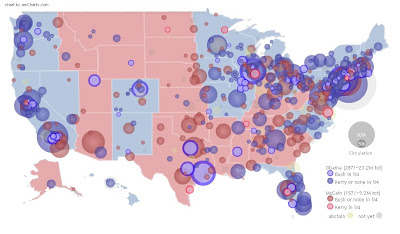
Continously Variable Circle Map

A continuously variable circle map demonstrates the quantity of a variable through the use of circles which vary in size according to the quantity of the variable at that particular point without limiting the size options for the circles. In other words, the size of the circle directly relates to the quantity of the measured variable.


The map below demonstrates presidential candidate endorsements by newspaper, with the size of each dot representing the circulation of the newspaper.


http://infochimps.org/static/gallery/politics/endorsements_map/endorsement_graph.html

Monday, September 29, 2008

DOQQ (Digital Orthophoto Quarter Quads)

DOQQs combine an areal photograph with the geometric qualities of a map by georeferencing the image and orthorectifying it. (Orthorectification is the process of adjusting the photographs to minimize distortion created in capturing an image of three dimensional terrain and translating the information to a two dimensional map.


http://rockyweb.cr.usgs.gov/software/mcmc/drgdoq_merge.gif

Sunday, September 28, 2008

Digital Elevation Model


A DEM is a digital map that shows terrain elevations for ground positions at regularly spaced horizontal intervals. They are often used to generate three dimensional images, with our without color, that show the relief of the location.


This image of the Sahara Desert was created using satellite imaging.

http://www.satimagingcorp.com/gallery/dem-sahara-tunisia-lg.html

Saturday, September 27, 2008

Digital Line Graph

Digital Line Graphs illustrate data such as topography, hydrography, boundaries, roads, utility lines, etc. with images stored as lines, points and areas.
The DLG shown here includes boundaries, hydrography and hypsography and can be found at

Friday, September 26, 2008

Digital Raster Graphics

A digital raster graphic, or DRG, is a scanned image of a United States Geological Survey (USGS) topographic map, which is georeferenced to the surface of the earth and fit to the Universal Transverse Mercator projection.


http://www.csc.noaa.gov/products/tsunamis/htm/images/ports/brook/brdrg.gif

Wednesday, September 24, 2008

Isopach Map


Isopach maps illustrate rock or sediment thickness using contour lines. The map shown here shows the thickness of sedements beneath Long Island.


Tuesday, September 23, 2008

Isohyet Map


A contour map that illustrates the third variable of rainfall using contour lines is an isohyet map.


This map represents the rainfall totals associated with Hurricane Rita in 2005.

http://www.srh.noaa.gov/shv/Drought2005.htm

Monday, September 22, 2008

Isotach Map


Isotach maps are contour maps which use contour lines to illustrate wind speed.

Sunday, September 21, 2008

Isobar Map

This contour map uses isobars to demonstrate the third variable of air pressure.

http://metservice.co.nz/default/index.php?alias=mapsandobservations

Saturday, September 20, 2008

Contour Map

This image represents a contour map of the famous Mona Lisa. A contour map is a type of
hypsometric map that uses contour lines to represent a third variable. Contours are lines that join equal values of the variable being mapped at a constant interval that describe the elevational change between contour lines.


In this example, the overall shape and distortion of the surface of the Mona Lisa, is illustrated, with the contour interval defined at the right-hand side of the image.

This image can be found at http://www.nrc-cnrc.gc.ca/aboutUs/nrc90/monalisa/contour_e.html

LIDAR

LIDAR uses laser pulses and GPS to create highly detailed images of earth surface phenomena.

This map shows the Clear Fork Watershed in West Virginia.

Friday, September 19, 2008

Doppler Radar


Doppler technology utilizes microwaves to track direction and speed of suspended water droplets in the atmosphere. This map was created by NOAA to show the inbound and outbound velocity couplets associated with a tornado in Arkansas.

http://www.srh.noaa.gov/meg/images/blysrm.jpg

Thursday, September 18, 2008

Upcoming Events in Asia


Remote Sensing - Fires


The US Forest Service presents this map, shown here in both US and Florida views, to illustrate recent fire occurrences.

http://activefiremaps.fs.fed.us/wms.php

Wednesday, September 17, 2008

Remotely-Sensed Map - Aerial Photograph

This aerial photograph of a corn maze, also known as a "maize", is a perfect example of how a photograph can be considered a map. In this case, the map can be recognized in a literal sense as it can help a viewer find his or her way through the maze. Photographs certainly do not have to be so obvious to be considered a map.


Tuesday, September 16, 2008

Cartographic Animation


Through modern technology, cartographers are able to animate maps to better illustrate a concept of geographic progression. The cartographic animation shown here portrays the separation of the world's continents. (Click on the image to view the animation.)

http://upload.wikimedia.org/wikipedia/commons/8/8e/Pangea_animation_03.gif

Monday, September 15, 2008

Statistical Map

Statistical map of Napoleon’s Russian campaign of 1812


The size of Napoleon’s army is shown by the dwindling width of the lines of advance (green) and retreat (gold). The retreat information is correlated with a temperature scale shown along the lower portion of the map. Published by Charles Minard in 1869

Sunday, September 14, 2008

Cartogram


This fashionable cartogram illsutrates world-wide clothing exports by portraying the size of each country not based on actual area of that country, but by the quantity of clothing that country exports.

http://www.worldmapper.org/images/largepng/83.png

Saturday, September 13, 2008

Flow Map


Flow maps are used to illustrate movement between places using flow lines that vary in width according to the quantity.


This map shows the flow of Texas truck freight.

http://www.lib.utexas.edu/maps/texas/combtrk_tx_1998.jpg

Friday, September 12, 2008

Isoline Map

An isoline map conveys numberical vaules for continuous distributions by means of lines joining points of equal vaule.


This map conveys the annual runoff depth of East China water transfer region and can be found at http://www.unu.edu/unupress/unupbooks/80157e/80157E0T.GIF.


Thursday, September 11, 2008

Proportional Circle Map

These proportional circle maps illustrate the distribution of four mineral deposits in the Selwyn Basin of Canada using circles that are sized according to the quantity of mineral found at that location.

http://gsc.nrcan.gc.ca/mindep/metallogeny/sedex/selwyn/images/fig22.jpg

Wednesday, September 10, 2008

Choropleth Map


A chloropleth map is a type of a thematic map which identifies a statistical variable by geographical area. In this example, we see the results of the 2004 Presidential Election by state. This map shows a number of statistical elements, including the declared winner for each state, the margin by which he won and the voter turnout.


I look forward to adding to this post by updating this particular map in November.

Tuesday, September 9, 2008

Dot Distribution Map

Dots distribution maps use visual imagery to illustrate the quantity of a particular variable by showing the distribution of that variable over a given geographical location.


The dot distribution map shown here illustrates the distribution of the world's population.


Monday, September 8, 2008

Propaganda Map

When I think of propaganda, I immediately think of Nazi Germany. This propaganda map distorted a true representation of geographical data created by the Nazis to convince the British that they were surrounded.

Sunday, September 7, 2008

Hypsometric Map


This hypsometric map shows the relief of the surface of the moon. Thid image portrays the topography of moon as the third dimension of the two-dimensional map through the use of vibrant color.


Saturday, September 6, 2008

PLSS


The PLSS typically divides land into 6-mile-square townships, which is the level of information included in the National Atlas. Townships are subdivided into 36 one-mile- square sections. Sections can be further subdivided into quarter sections, quarter-quarter sections, or irregular government lots. Normally, a permanent monument, or marker, is placed at each section corner. Monuments are also placed at quarter-section corners and at other important points, such as the corners of government lots.


This map of Alabama showing PLSS townships can be found at: http://www.rootsweb.ancestry.com/~alfrankl/landrecords.htm

Friday, September 5, 2008

Cadastral Map

A cadastral map, or so-called "indication sketch", became the graphical component of the cadastre around the middle of the 19th century. Maps were a result of the first trigonometric allocation. In this, all parcels were marked by topographic numbers and houses by house numbers. Cadastral maps show all houses, parcels, water areas and trails of particular villages.

http://agresearchservices.com/hist_sources.html

Thursday, September 4, 2008

Thematic Map

This thematic map shows the system behind the assignment of zip codes, with state names overlaid. Specifically, the creator of this map wanted to demonstrate what would happen if you connected each zip code in ascending order. The pattern illustrates some interesting information relating to the density of zip codes as assigned across the United States. It is important to note that not all of the breaks between zip codes match exactly with state borders, which are imposed behind the zip code distribution lines.


This map can be found at http://eagereyes.org/Applications/ZIPScribbleMap.html.