
The map below demonstrates presidential candidate endorsements by newspaper, with the size of each dot representing the circulation of the newspaper.
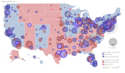
http://infochimps.org/static/gallery/politics/endorsements_map/endorsement_graph.html
 DOQQs combine an areal photograph with the geometric qualities of a map by georeferencing the image and orthorectifying it. (Orthorectification is the process of adjusting the photographs to minimize distortion created in capturing an image of three dimensional terrain and translating the information to a two dimensional map.
This image of the Sahara Desert was created using satellite imaging.
http://www.satimagingcorp.com/gallery/dem-sahara-tunisia-lg.html Digital Line Graphs illustrate data such as topography, hydrography, boundaries, roads, utility lines, etc. with images stored as lines, points and areas.


 This contour map uses isobars to demonstrate the third variable of air pressure.
This image can be found at http://www.nrc-cnrc.gc.ca/aboutUs/nrc90/monalisa/contour_e.html
 LIDAR uses laser pulses and GPS to create highly detailed images of earth surface phenomena.
http://www.srh.noaa.gov/meg/images/blysrm.jpg


 These proportional circle maps illustrate the distribution of four mineral deposits in the Selwyn Basin of Canada using circles that are sized according to the quantity of mineral found at that location.
http://gsc.nrcan.gc.ca/mindep/metallogeny/sedex/selwyn/images/fig22.jpg


 When I think of propaganda, I immediately think of Nazi Germany. This propaganda map distorted a true representation of geographical data created by the Nazis to convince the British that they were surrounded.

This map of Alabama showing PLSS townships can be found at: http://www.rootsweb.ancestry.com/~alfrankl/landrecords.htm
 A cadastral map, or so-called "indication sketch", became the graphical component of the cadastre around the middle of the 19th century. Maps were a result of the first trigonometric allocation. In this, all parcels were marked by topographic numbers and houses by house numbers. Cadastral maps show all houses, parcels, water areas and trails of particular villages.


"The World According to Dubya" can be found at http://strangemaps.files.wordpress.com/2006/12/298202156_73e54012fa_b.jpg
